Showing posts with label typography. Show all posts

Thursday, June 23, 2011

Bookends For Letter Lovers. A-Z Cast Concrete Bookends by Jochen Korn.


The “A-Z” bookend series from the designer Jochen Korn are manufactured from special concrete and weighing roughly 2.5 kg each so they not only provide a charming optical frame for supporting light books and magazines, but offer reliable support to illustrated books, encyclopaedia and heavy collections of books.


Cast as six different bookends, each featuring four letters:


The special sophisticated cast procedure used to work the concrete material makes each bookend is unique, with a surface structure that differs slightly from all the others. The bookends are mounted on a stainless steel base with a non-slip rubber underside that protects surfaces.

The Red Dot Museum shop sells the “ABCD” and “WXYZ” for 49,90 € each.
Buy them here.

You can also purchase the entire set of all six from Korn. Learn more here.
Or contact Korn directly:(05 61) 45 06 51 03

Designer: Jochen Korn
Versions: “ABCD” and “WXYZ”
Material: Special concrete, stainless steel, sponge rubber
Size: 215 mm x 70 mm x 70 mm
Weight: 2.5 kg
Manufacturer: Korn Produkte, Kassel, German

The bookends come in a high-quality and sturdy gift box.

Wednesday, June 1, 2011

ABC Bookcase - Letters and Numbers Modular Cube Storage from Saporiti


The ABC bookcase (libreria ABC) is a fun and functional series of modular storage cubes shaped as letters and numbers designed by Eva Alessandrini and Roberto Saporiti for the Italian furniture design firm Saporiti.


above: I so gotta get me these, don't you think?

You can assemble any number of the sophisticated looking cubes to form words or sentences as in the examples of the "Read your book case","News" and "XOXO" compilations shown below:


The cubes are available in three sizes and a number of interior wood stains and exterior colors.


Nicely designed, the modular storage works in any style room for children or adults. For pricing or more information about the ABC Libreria, contact Saporiti here

Wednesday, May 11, 2011

Fontable Letter & Number Tables Spell Out C-O-O-L.


Designers Alessandro Canepa & Andrea Paulicelli of Italy's Mamadesignlab have created Fontable, a collection of alphanumeric metal tables.


The new concept in modular elements brings a revolution to the world of furnishing accessories, building upon a graphic matrix to turn it into an item for interior design.


FONTABLE are alphanumeric elements reproducing letters from A to Z in lower and upper case and numbers from 0 to 9 which become modular tables. Each element acquires three dimensions and personality and can be played around with, to customize ever changing and dynamic shapes.


Tables are made in steel sheet with lacquered varnishing in white, black and red, with legs in anodized aluminum of adjustable height allowing to overlap table surfaces. Special finishing and further color variations are available on demand.

Produced in a small atelier outside of Milan under the supervision of Alessandro & Andrea the tables are made from steel sheet with lacquered varnishing in white, black and red. Legs are in anodized aluminum and are height adjustable, allowing overlap of table surfaces.

You can purchase the tables from Outdoorz Gallery.

Wednesday, April 6, 2011

Kubrick Remasters, Graphic Art Posters Inspired By Stanley Kubrick


It's a Stanley Kubrick day today on the blog. If you didn't read the post prior to this one on the amazing retrospective of the legendary director's work, please do. It's what inspired this post of the fabulous graphic artwork of Nick McLellan.

A companion to the exhibition at La Cinémathèque, Kubrick et le Web is a site which showcases the best of web creation on Kubrick, a contest in partnership with Dailymotion.

There are so many talented artists, designers, photographers and filmmakers out there that it is almost hard to believe. But one look at the numerous pieces of work inspired by Kubrick and his movies, you will have no doubt. One of the standouts on the site is the work of artist and designer Nick McLellan. His Kubrick Remasters Series is beautifully conceived of and executed.

Take a look:


See more of Nick's work here on Deviant Art

Thursday, March 31, 2011

Transforming Modern Architect's Works Into 3D Typefaces


Designer Chris Labrooy, inspired by his design heroes; architects Tadao Ando, Zaha Hadid, Toyo Ito, Oscar Niemeyer, Frank Gehry and designer Ettore Sottsass, has created 3D typography based on their works using computer rendering and illustration.

Tadao Ando 3D Type
Typography design based on the architecture of Tadao Ando. Chris chose his favourite Tadoa buildings as a basis for developing these expressive letter forms. Included are: Chikatsu Asuka historical museum / Water temple / Naoshima contemporary art museum annex:
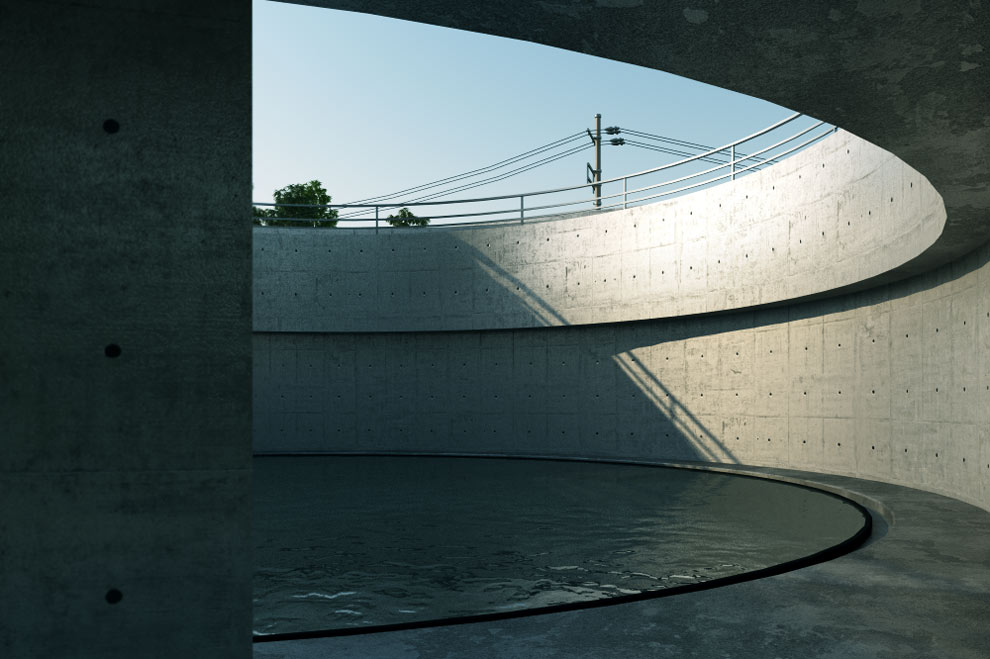


Zaha Hadid 3D Type
Typography design based on the architecture of Zaha Hadid. With this piece, Chris focused on capturing Zaha's formal language rather than reference specific buildings because he claims to be interested in her drawings and paintings from the eighties.:


Oscar Niemeyer 3D Type
Typography design based on the architecture of Oscar Niemeyer. Chris picked his favourite Niemeyer buildings as a basis for developing these expressive letter forms. Included are : Cathedral of Brasília / Niterói Contemporary Art Museum / Ibirapuera Park theatre / Oscar Niemeyer Museum.


Toyo Ito 3d type
Letter forms inspired by Toyo Ito's impressive works. The combination of simple forms with inricate perforations is what excited Chris about Toyo's work. These letters are based on : TOD's omotesando / Tower of winds / Taichung opera house / Mikimoto department store:


Frank Gehry 3d Type
Typography design based on the architecture of Frank Gehry. Chris picked his favourite Gehry buildings as a basis for developing some expressive letter forms. Included are: Guggenheim Bilboa / Aerospace museum / Gehry house / experience music project / dancing house prague:


Although not an architect. Ettore Sottsass' memphis style designs inspired Chris to create a font.

Ettore Sottsass 3d Type
Letter forms inspired by Sottsass's early 80's furniture. This work is Chris' attempt to revisit the past, get inspired, and share with people new and interesting interpretations on familiar historical works:


His Helvetica 3D Type does the opposite of the above works. In this font, Chris has turned a typeface into architecture:


For Bauhaus, Chris took a design style and sensibility and also turned it into a 3d rendering of a building:


Also worth noting is his "Playful Type" made of sex toys:

See more of Chris Labrooy's fabulous work here.

Via Architizer